在 HTML 中快速构建现代网站,无需离开编辑器。
这是一个实用优先的 CSS 框架,内置了大量类似 flex、pt-4、text-center 和rotate-90 这样的工具类, 你可以直接在标记中组合它们来构建任何设计。
<div class="flex flex-col items-center rounded-2xl"> <div> <img class="size-48 shadow-xl" alt="" src="/img/cover.png" /> </div> <div class="flex"> <span>Class Warfare</span> <span>The Anti-Patterns</span> <span class="flex"> <span>No. 4</span> <span>·</span> <span>2025</span> </span> </div></div>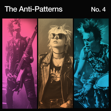
为什么选择 Tailwind CSS?
专为现代网站开发设计.
Tailwind 毫不妥协地采用了最新的 CSS 特性,让开发者获得最愉悦的开发体验。
Okay, it’s not exactly cutting edge, but just throw a screen size in front of literally any utility to apply it at a specific breakpoint.


This sunny and spacious room is for those traveling light and looking for a comfy and cozy place to lay their head for a night... Show more
Show more

What’s a website these days without a few backdrop blurs? Keep stacking filters until your designer asks you to please, please stop.

If you’re not a fan of burning your retinas, just stick dark: in front of any color to apply it in dark mode.
Customizing your theme is as simple as creating a few CSS variables.
@theme { --font-sans: "Inter", sans-serif; --font-mono: "IBM Plex Mono", monospace; --text-tiny: 0.625rem; --text-tiny--line-height: 1.5rem; --color-mint-100: oklch(0.97 0.15 145); --color-mint-200: oklch(0.92 0.18 145); --color-mint-300: oklch(0.85 0.22 145); --color-mint-400: oklch(0.78 0.25 145); --color-mint-500: oklch(0.7 0.28 145); --color-mint-600: oklch(0.63 0.3 145); --color-mint-700: oklch(0.56 0.32 145); --color-mint-800: oklch(0.48 0.35 145); --color-mint-900: oklch(0.4 0.37 145); --color-mint-950: oklch(0.3 0.4 145);}The color palette now uses more vibrant wide gamut colors without you needing to understand what any of that even means.
Using grid utilities directly in your HTML makes it so much easier to reason about complex layouts.
Browse properties


Transitions that work the way you'd expect — throw a few utilities on an element and you're in business.
transition duration-750linear
transition duration-750ease-out
transition duration-750ease-in-out
transition duration-750ease-in
Tailwind uses CSS layers so you don’t have to worry about specificity issues.
@layer theme, base, components, utilities;@layer theme { :root { /* Your theme variables */ }}@layer base { /* Preflight styles */}@layer components { /* Your custom components */}@layer utilities { /* Your utility classes */}Supporting multiple language text directions is no longer a nightmare.
Tag an element as a container to let children adapt to changes in its size.
<div class="@container"> <div class="grid grid-cols-1 @sm:grid-cols-2"> <img src="/img/photo-1.jpg" class="aspect-square @sm:aspect-3/2 object-cover" /> <img src="/img/photo-2.jpg" class="aspect-square @sm:aspect-3/2 object-cover" /> <img src="/img/photo-3.jpg" class="aspect-square @sm:aspect-3/2 object-cover" /> <img src="/img/photo-4.jpg" class="aspect-square @sm:aspect-3/2 object-cover" /> </div></div>No need to remember that complicated gradient syntax — create silky-smooth gradients with just a few utility classes.
Redefining real-time performance
Our next-generation rendering engine delivers unmatched speed and efficiency, empowering creators to push boundaries like never before.
Sometimes two dimensions aren’t enough. Scale, rotate, and translate any element in 3D space to add a touch of depth.
工作原理
更快更小的构建结果。
Tailwind 在生产构建时会自动移除所有未使用的 CSS,确保你的最终 CSS 包尽可能小。事实上,大多数 Tailwind 项目传输给客户端的 CSS 不到 10kB。
<!DOCTYPE html><html lang="en"> <head> <meta charset="UTF-8" /> <meta name="viewport" content="width=device-width, initial-scale=1.0" /> <title>Tailwind CSS</title> <link rel="stylesheet" href="/build.css" /> </head> <body> <button class=""></button> </body></html>@layer utilities {}Tailwind 在实践中
无需修改 CSS 文件,构建任何你想要的。
由于 Tailwind 的底层特性,它从不会限制你重复设计相同的网站。你最喜欢的一些网站就是用 Tailwind 构建的,而你可能完全没有察觉。


现成的组件
使用 Tailwind UI 更快前进
Tailwind UI 是一个精美的、完全响应式的 UI 组件集合,由我们这些 Tailwind CSS 的创建者设计和开发。它包含了数百个现成的示例供你选择,一定能帮你找到理想的起点。